Okay, don’t let that title stress you out. We know how intimidating and formal words like “high-converting website homepage” and “StoryBrand framework” can sound.
If you’re like most of our clients, you don’t want to deal with the website mumbo-jumbo and just want to focus on helping your customers. That’s why we’ve created this guide, with several StoryBrand website examples, that’ll break down the process of how to build a high-converting website.
Take a deep breath, sit back, and get ready for everything to get easier.
What is StoryBrand?
StoryBrand is a 7-part framework that is used in marketing. Here at Evolve Global Marketing, we are an official StoryBrand certified guide — which basically means that we have a Bachelor’s degree in the 7-part StoryBrand framework and use it to help our clients build clear messaging that works. The StoryBrand framework helps us create a brandscript using story-based marketing, then convert that into a high-converting website.
While we can’t give away the StoryBrand secret sauce, we are going to walk you through how several examples of StoryBrand websites look like from our previous work. This will help you understand what type of messaging works for businesses, and why story-based marketing is so important if you want a high-converting website that generates leads and drives sales.
Let’s get started!
High-Converting Website Examples:
The Hero Section
The hero banner is your first (and sometimes, only!) chance to make a lasting impression on website visitors. It will tell the customer which of their problems you are going to solve and their potential results, and have a call to action (CTA) for them to get started.
After the navigation bar, this is the first section that you will see on our clients’ websites: the hero banner.
Take a look at two of our clients’ hero sections:

When people see this hero section, their problems are quickly and concisely teased and solved. It creates a sense of intrigue and wanting to know more, so they keep scrolling — and that’s exactly what you want to happen!

As you can see, the section is short, clear, and concise. Most first-timers on your high-converting website will be there for no longer than 5 seconds, if that. You have a very small window of opportunity to catch their attention and make them want to keep scrolling, and the hero section is where you do that.
Pro-Tip:
When someone visits your high-converting website’s landing page, the first thing they see is the hero section and the navigation. Many people make the mistake of cluttering their menu navigation with things nobody cares about. (Sorry! It’s true.) Limit your navigation to the aspects that need to be there, including a big ‘ole call-to-action button — we’ll get into that later. Anything else, leave for the Junk Drawer section.
The Problem Section
Next is the problem section, where you’ll dive deeper into the customer’s problem and tease your solution. Be warned, however, this is not your opportunity to write paragraphs and paragraphs of copy about the problem. If you’re going to remember one thing from this article, remember this: quality over quantity.
Hone in on what the biggest problem your customers is facing, and write your problem section based on that. At the end of the problem section, you’re going to quickly and subtly tease the results that your customer could have if they overcome the problem.
Figuring out what the biggest problem is and how to message it is a really challenging task when building a high-converting website, and it’s something that most businesses go wrong.
Pro-Tip:
This isn’t the place to clearly state what they’ll gain by hiring you — that comes next. Instead, use one sentence at the end to state the outcome of overcoming their problem or what they’re losing by not overcoming their problem.
Take a look through these problem sections below to better understand how it works.
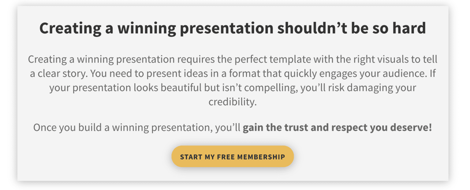
In just three sentences, this problem section states the customer’s biggest problem, illustrates the outcome of solving that problem, and guides visitors to take action to solve the problem through a call-to-action.
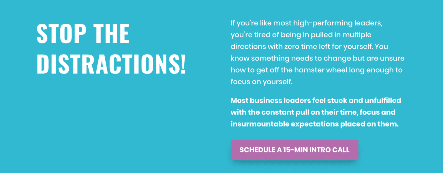
Another awesome example of a problem section on a high-converting website. The problem is clear, the reader’s feelings about that problem are stated, and the call-to-action indicates a solution to the problem. Clear, engaging, and perfect!
The Value Stack
The Problem Section gets your customer thinking about what issues they’re dealing with — because you’ve clearly spelled it out for them. You’ve teased a solution, now you’re going to go full force with what they will gain by hiring you. This is where the Value Stack comes in on your high-converting website.
In this section, you’re going to illustrate to your readers what value you will bring them. In other words, you’re going to show them what they will gain by working with you. How do you figure this out? Easy.
Look at your outcomes.
- What does your product/service help your customers achieve?
- When your product/service is successful, how do your customers feel?
- What are your customers’ goals?
- What does life look like when your customer succeeds?
Use these questions to consider what to put into your value stack on your high-converting website.


As you can see, the language and content of the value stack should illustrate the outcomes of overcoming the customers’ problems on your high-converting website. You can use questions in this section, but you definitely don’t have to. Depending on our customer and what works best, we vary the type of sentence we use.
Pro-Tip:
With all the information overload in the world, people don’t read websites anymore, they scan them. Make your value stack simple and easy to scan on your high-converting website by incorporating bullet points or just by using simple, concise statements.
When you’re writing this section, try to imagine your customer nodding in agreement at every bullet in your value stack. You want your customer to relate to the copy here on your high-converting website, and they want to achieve what you’re saying they can achieve.
You Can
Create a High-Converting Website That Works
Want to start getting the online sales you deserve?
Yes, I am ready to get more sales!The Guide
One of the most important parts of understanding how to write a hero section on your high-converting website is knowing that you are not the hero. Yes, you read that correctly. Instead of positioning yourself as the person who will solve all of your customers’ problems, position your business as the guide that will lead your customers through solving their own problems. It may sound counterintuitive, but trust us! This is what creates lifelong customers.
We see a lot of websites where businesses spend way too much time talking about themselves. The truth? Potential customers don’t care. When they’re on your website, they need to read and see words that they relate to, and that makes them want to buy what you’re offering.
Have you noticed that up until this point, you haven’t talked about yourself at all? Good! You should not be the hero of this journey. Your high-converting website homepage is about your customer and which of their problems you’re going to solve.
But of course, your customer may want to know a little bit more about you. If you are an individual, this is a good place to introduce yourself briefly and articulate your role in guiding your customer through their journey. If you are a larger brand, you don’t need to introduce yourself on a high-converting website, but you should still illustrate your role in solving your customers’ problems.
The way you show yourself as the guide is through empathy and authority. You want just enough of these to demonstrate that you know what the heck you’re talking about and can help guide them to success. Empathy, specifically, conveys relatability and assures them that you understand them and their problem. And that’s your goal with a high-converting website, to make your customers feel like you know them and know how to find them success.

In this great high-converting website example, she introduces herself and empathizes with the customer, but then quickly switches the focus to showcase her authority as a Proctor Gallagher Certified Coach.

This example doesn’t have a personal introduction because the brand doesn’t have a personal guide. Instead, it starts with three empathetic sentences that help relate to the customer. Then, they use their experience to demonstrate authority and finish it off with a call-to-action.
Both examples articulate how the brand will guide the customer through their journey and mention the outcomes of working with them.
Pro-Tip:
When you’re writing this section, try to imagine your customer nodding in agreement at every bullet in your value stack. You want your customer to relate to the copy here and want to achieve what you’re saying they can achieve.
Additional Ways to Show Authority as a Guide
You will want to demonstrate your brand’s authority to the customer on your high-converting website in a tasteful and effective way. They need some indication that will check a box in their mind that you are the real deal, but it shouldn’t be anything extensive. Our recommendation? Showcase some of your clients using logos.

More than likely, your website visitor will quickly scroll through this section — and that’s okay! All you need from them is a quick glance that verifies your authority, and an authority section like the one on the high-converting website above will do just that.
Pro-Tip:
You can include a testimonial here or somewhere further down on the webpage. We like to have one singular quote or a scrolling quote bar. Just like the logos, a testimonial on the homepage shouldn’t be extensive. Your customer is reading it to see that you are the real deal, not because they care about every single word that your client said about you. It gives them a bit of reassurance that they can trust you, and it adds to your authority. So if you feel like you need it, add a testimonial, but don’t overdo it. Too much authority will make you seem desperate, and you definitely don’t want that!
The Plan
Okay, so you’ve talked about their problems, you’ve shown them what they can achieve, what’s next for your high-converting website? How they can achieve their goals, which comes to us in the Plan. Write out the three easy steps that your customers will take to achieve their goals. Why three, you ask? It is scientifically proven that once we go beyond three in a list, we lose interest. Most businesses need more than just three steps to execute their work, but that’s not the point!
The key for your high-converting website is to keep the plan simple and easy to consume, even if your business is complicated. So, stick to three (at most, four… but only if you have to). One of these steps should include taking action and signing up for your product/service and the last step should be the outcome of working with you.
Take a look at the examples below to see how it’s done.

This is a perfect example of a plan! It is short, sweet, and to the point. The first step is the action the customer takes, the second step is what the customer will get directly from taking action, and the third step is the outcomes that the second step can yield.

Similar to the example above, this plan is easy to consume and clear. The customer sees what they need to do (Step 1), what they will get (Step 2), and what they will achieve (Step 3).
Pro-Tip:
This section should be one of the shortest, copy-wise on your high-converting website. All you need are the three steps, and that’s it. Trust us, we know it’s exciting to show your customers what you can do, but three is the magic number!
Direct & Transitional Call-to-Action
The Transitional Call-to-Action
While you’re going to give your potential customer ample opportunity to connect with you on the homepage of your high-converting website, the Transitional Call-to-Action is a way to get the reader to engage without signing up for your service just yet. Think about it like a relationship: Not all people want to marry you (or your brand) when they first meet you. Instead, they might want to date you first (or your brand… you get it). For this reason, we offer a transitional call to action to allow them to get to know your brand better before they buy it.
Our favorite way to do this on a high-converting website is through a free lead generator that you send them via email. Lead generators are integral parts of sales funnels and we could talk about them for days. For now, what you need to know is that offering a free lead generator or another type of introductory CTA will allow you to get your reader’s email address and put them in your nurture funnel.
Here’s what it looks like in action.

Accompany your lead generators with short copy that quickly overviews the problem that this resource will solve for your customer.

The CTA under the lead generator on your high-converting website will prompt users to enter their email and boom! You have a new lead.
Pro-Tip:
Implement a comprehensive sales funnel on your high-converting website! When you put a transitional CTA on your site, which is part of a sales funnel, you can then nurture the relationship until they feel comfortable taking that next step to do business with you. But this only works if you have a sales funnel ready to go and follow-up with the potential customer. If you forget to build it out, someone might download your resource then never hear from you again. The key to a transitional CTA is to build a relationship.
The Direct Call-to-Action
You will need to place direct call-to-action on your homepage several times on a high-converting website (StoryBrand recommends the magic number eight). You cannot expect that your customers will know what to do unless you ask them to. So, ask them. Repeatedly. Don’t overwhelm them with CTAs of course, but after each section on your page, post a CTA.
Your CTA will depend on the type of product or service you offer, and the action you want your customer to take.
Here are some Call-To-Action buttons / text examples:
- Schedule a Call
- Book a Session
- Browse Now
- Pre-Order Here
- Sign-Up Today
Keep your call-to-action consistent throughout your high-converting website, as it will remind your customer of the action that they should take to solve their problems and achieve their goals.
The Junk Drawer
The final “official” section of your high-converting website is the Junk Drawer. Junk drawers vary by brand and are not necessary. This section is where you put anything else that you absolutely need on your homepage or wanted to originally put in your navigation bar, but does not fit into one of the other sections. If you’re redoing your website and are hesitant to get rid of some of the aspects you’ve already developed, this is a perfect place to put them. Junk drawers can include a link to scroll through your projects, a testimonial, a video, about page, contact us, etc. Keep it short and sweet and don’t overcrowd your home page with additional content.
And there you have it! While this isn’t a comprehensive guide to the intricacies of StoryBrand, we hope that you have a better understanding of what StoryBrand looks like on a website landing page. Once you’re ready to see the wonders of story-based messaging work its magic, we’d love to meet you. Schedule a call with us by clicking the button below
Website Examples
Below are a couple of our StoryBrand websites and BrandScript that we’ve created for clients. You’ll find the scope of work and a link to detailed case studies.
SCOPE OF PROJECT
Brand Strategy
Brand Development & Rebranding
Logo & Icon Design
Color and Typography
Brand Style Guides
Story-Based Messaging
Marketing Collateral
Lead Generating PDF
Social Media Graphics
Website Design & Development
Wireframing
Copywriting
Story-Based Messaging
SCOPE OF PROJECT
Logo & Icon Design
Story-Based Messaging
Website Design & Development
Wireframing
Copywriting
And there you have it! While this isn’t a comprehensive guide to the intricacies of StoryBrand, we hope that you have a better understanding of what StoryBrand looks like on a website landing page. Once you’re ready to see the wonders of story-based messaging work its magic, we’d love to meet you. Schedule a call with us by clicking the button below
Happy evolving!



One Comment